Scoped Dark Mode with data-theme: How I Handled Themable Widgets

Build Logs & Projects\\Apr 6, 2025

While working on a client project last week, building an embeddable AI chat widget, I ran into a theming challenge. The client wanted the widget to support light and dark modes, but not based on the entire page’s theme. The widget needed to be self-contained, meaning its theme shouldn’t care what the rest of the site was doing.

Tailwind CSS, of course, has a well-known dark mode setup using the .dark class or the user’s system preference via media. But neither of those worked for this use case. I didn’t want to rely on the host page’s global classes or ask developers to manually toggle .dark on the
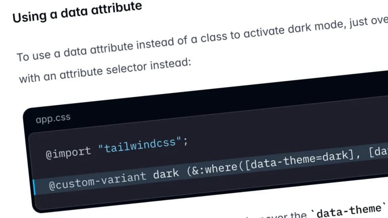
 <html> tag.

So I went with data-theme, scoped right inside the widget.

Let’s break down how I pulled this off, and why you might want to do the same.


The problem: Tailwind’s .dark class is global

The traditional Tailwind setup expects dark mode to be triggered globally:

<html class="dark">
  <div class="bg-white dark:bg-black">
    ...contnet goes here...
  </div>
</html>

This is fine for full apps or sites you control, but it doesn’t work for a standalone widget injected into other websites. I needed something local, something that could say:

“This section right here is in dark mode. Ignore everything else.”


Here comes the data-theme attribute

Turns out you can scope styles in Tailwind using data-theme, especially if you’re using DaisyUI or a bit of custom plugin magic.

Here’s how I used it:

<div data-theme="dark" class="p-4 rounded">
  <p class="text-base-content">I'm in dark mode</p>
</div>

Simple, right? That data-theme="dark" attribute activates the theme just for that section.

No need to mess with the global <html> or <body> tag. No classList juggling. Just drop the attribute and style your stuff.


Tailwind config: adding support for data-theme

Tailwind itself doesn’t understand data-theme out of the box, you need to either use a plugin like DaisyUI (which comes with theme support baked in) or define your own variants.

Here’s how I did it without DaisyUI:

// tailwind.config.js
const plugin = require('tailwindcss/plugin');

module.exports = {
  content: ['./index.html', './src/**/*.{ts,tsx,js,jsx}'],
  theme: {
    extend: {
      colors: {
        surface: {
          light: '#ffffff',
          dark: '#1e1e1e',
        },
      },
    },
  },
  plugins: [
    plugin(function ({ addVariant }) {
      addVariant('theme-dark', '&[data-theme="dark"]');
      addVariant('theme-light', '&[data-theme="light"]');
    }),
  ],
};

Now I could write scoped variants like this:

<div
  data-theme="dark"
  className="theme-dark:bg-surface-dark theme-dark:text-white theme-light:bg-surface-light theme-light:text-black"
>
  Scoped theming FTW.
</div>

This gave me the freedom to switch themes without global class shenanigans.


Theme toggle logic (super simple)

Since we’re working with data-theme, toggling themes is as easy as flipping an attribute:

const container = document.getElementById('my-widget');

container?.setAttribute('data-theme', 'dark');
// or:
container?.setAttribute('data-theme', 'light');

No need for classList.add/remove, no dependency on the outer DOM. Just update the attribute and Tailwind + CSS does the rest.


Bonus: it plays nice with Shadow DOM

This was huge for me. The chat widget I was working on runs inside a Shadow DOM, so relying on global classes like .dark isn’t an option anyway. Scoped data-theme attributes respect DOM boundaries and don’t leak outside.

Here’s a simplified Shadow DOM example:

const shadowRoot = myWidget.attachShadow({ mode: 'open' });

const wrapper = document.createElement('div');
wrapper.setAttribute('data-theme', 'dark');
wrapper.innerHTML = `
  <div class="p-4 theme-dark:bg-gray-900 theme-dark:text-white">
    This dark mode stays inside the widget.
  </div>
`;

shadowRoot.appendChild(wrapper);

That data-theme="dark" only affects the content inside the Shadow DOM. Exactly what I needed.


Could I have used .dark?

Technically… yes. I could’ve passed a prop or class and toggled .dark on the container, then told Tailwind to use class-based dark mode in the config.

But I’d still be relying on global CSS logic, and the whole point was to decouple the widget from the host site’s theme system. data-theme gave me that clean separation with minimal fuss.


A few quick lessons learned

  • You can use data-theme anywhere, not just on <html> or <body>.
  • It works perfectly for scoped sections, widgets, or theme previews.
  • With a little Tailwind plugin magic, it’s just as powerful as the .dark class, and honestly, way more flexible.
  • If you’re using DaisyUI, you get all this out of the box. But even without it, it’s just a few lines of config.

Wrapping up

On this project just trying to add a theme toggle, and came out appreciating how simple scoped theming can be when you use data-theme. Whether you’re building a full app or a tiny embeddable widget like I was, this approach keeps your theme logic modular, clear, and zero-drama.

Next time you’re setting up dark mode, ask yourself: does this really need to be global? If not, try scoping it with data-theme. You’ll probably like how it feels.

Get In Touch

Have a question or just want to say hi? I'd love to hear from you.

Use this form to send me a message, and I aim to respond within 24 hours.

Stay in the loop

Get a weekly update on everything I'm building with AI and automation — no spam, just real stuff.

Goes out once a week. Easy unsubscribe. No fluff.
© 2025All rights reserved
MohitAneja.com